Sometimes abstract work defies my attempts to give it a title, but in this case, I think the ink does look a bit like it is encased in stone. Of course, others may see it differently, which is one of the neat things about abstract art.
This piece continues my explorations of using watercolor backgrounds to ink foregrounds and blends. I like how the textures turned out.
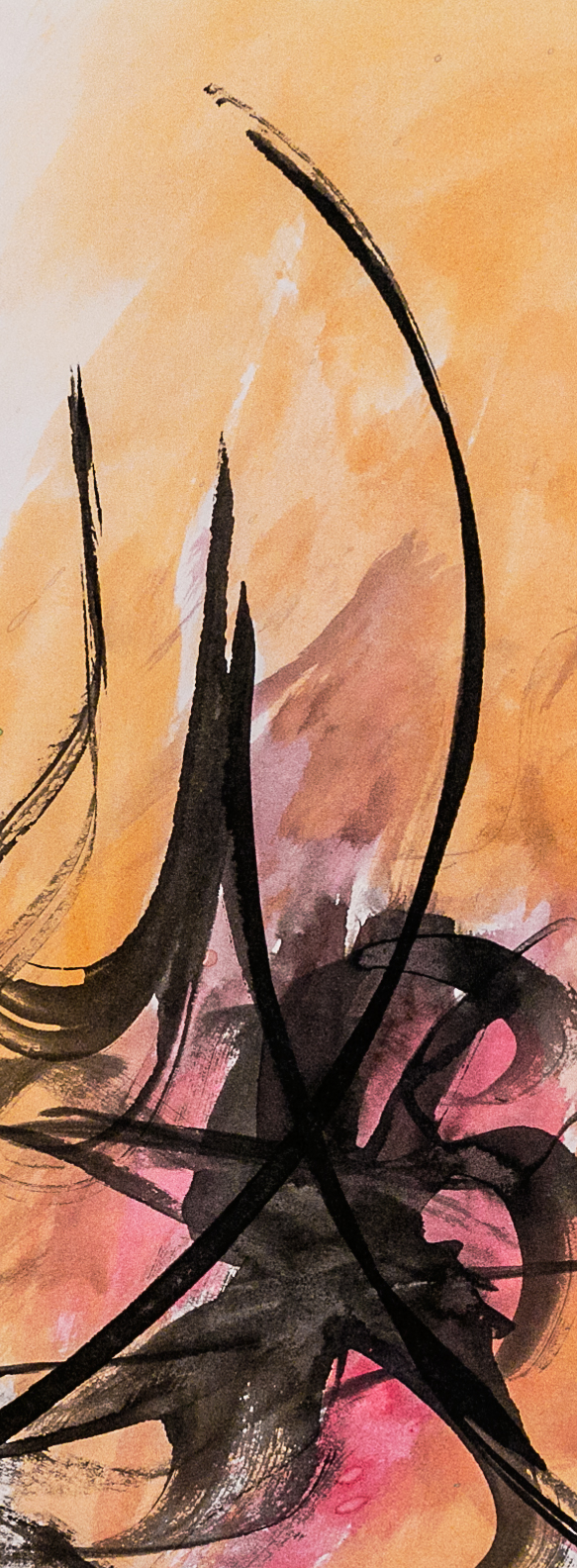
One more in a series of pieces, where I’m experimenting with lines and elongated shapes. The aim is to avoid as many parallels and right angles as possible, while at the same time creating an image that hangs together.
I love to make flowing marks on paper and that is basically what this is. This may not be for everyone, but I find it very enjoyable to do and to contemplate. It was done with ink and a bamboo pen I made.
What works? I think there should be a combination of graceful lines, interesting forms and angels, and a sense that it is a whole. I have done a lot of sketches like this over the years and have found that it is almost impossible to actually plan how to do them. You have a general idea of what you’re after, but then you have to let your hand take over. I find that most times what emerges is not that interesting, but if I keep at it, something very intriguing can result.
This is another adventure with ink and watercolor washes on heavy stock paper. More and more, I am finding that the noise of the photograph can actually enhance the effect, especially on the screen.
Prints, including canvas and metal, available at Fine Art America.
This is another crop from the larger ink on watercolor painting I did two weeks ago. The first crop is called Vertical Parallel 1, so this is the second in a series of what will be three. This image is very wide, meaning it comes out very narrow in the format of this site; but if you click on it, you will see a larger version of it.
This one is ink on heavy stock with some light washes. I think it is another example of a very tight vertical crop working better than a traditional format.
Ink and watercolor on mixmedia stock. In the last week or two, I’ve been adding color to my ink sketches. Sometimes, the color goes on first, so it doesn’t interfere with the ink and is basically a background element. But at other times, I add the color later and let it interact with the ink. In this case, I added the color first as the background.
Ink and watercolor on mixmedia stock. This is a crop from a larger piece where I think the composition broke down. But I was really happy with how certain parts of it turned out. This is one of those smaller parts.
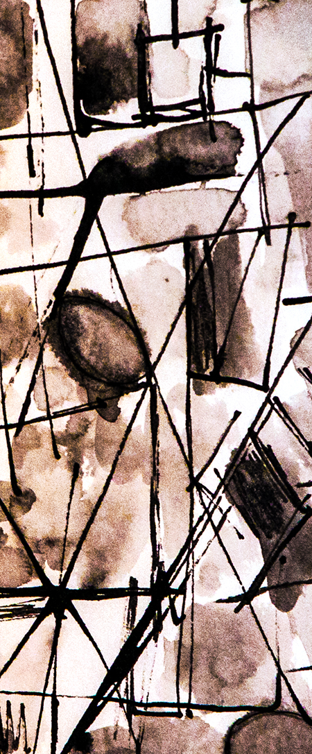
I have been enjoying experimenting with straight lines in ink that, for the most part, do not intersect. I have tried it with both the solid white background of the paper and with color and like the color much more. In my view, it gives the piece more depth and additional interest.


You must be logged in to post a comment.