This is an experimental piece, where I tried to create some interesting looking brush strokes starting with kind of a “plop” in the mid/upper right area of the paint. It is acrylic paint applied with a Japanese shodo (calligraphy) brush.

This is an experimental piece, where I tried to create some interesting looking brush strokes starting with kind of a “plop” in the mid/upper right area of the paint. It is acrylic paint applied with a Japanese shodo (calligraphy) brush.
This is acrylic applied to heavy stock paper with a Japanese calligraphy brush. Nothing particularly subtle here. I was just trying to play with broad strokes and the brush lines. In addition, the lighter elements show some wet-on-wet effects.

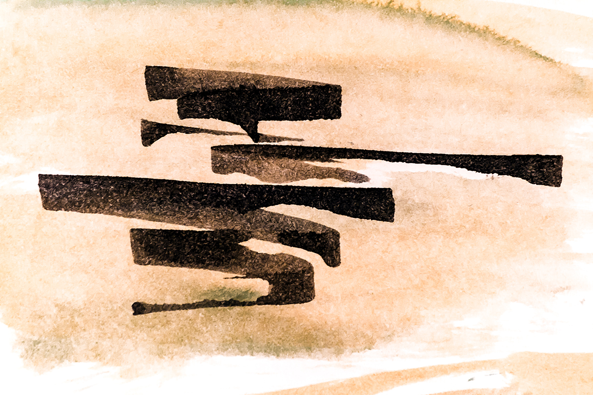
I started this piece by laying down some watercolor washes. Then after the paper was fully dry, I created the black lines using a folded ruling pen to apply ink. The ruling pen is still a new tool for me, but I love the straight lines, angles, and other effects that it makes possible. I should also say that while this may look like an Asia language to some, it is not. Inspired by calligraphic writing I’ve seen someplace? Quite likely, but there’s not a direct connection to anything as far as I can tell. These pieces sometimes “create themselves” and so any deeper background influences are hard to discern.

Ink and water color on heavy stock.

Ink applied with ruling pen with some very light watercolor washes.

Ink on watercolor washes in the background. I like how the colors literally came together on this one.

This is another experiment, using just watercolor pencils, some washes, and regular graphite on light sketching paper. My technique was to create lines and a composition, along with some colors that I would bring out in more vibrant fashion in post-processing using Lightroom and a bit of Photoshop. Here is the original drawing, which doesn’t look like much. Very low contrast and not much color. Overall very flat.

In Lightroom, I added a bit more exposure, then cranked up the clarity and vibrance along with saturation (a bit). In doing, that the yellow color in the paper became much stronger. I also adjusted the whites and blacks to give it a bit more contrast. From there, I went into the color adjustments to modify the hue, luminance, and saturation. Finally, I tried a few sharpness and noise settings. I was not worried too much about the extensive noise, because I thought it lent some interesting texture to the image, which of course had been there from the beginning. Here is the final result.

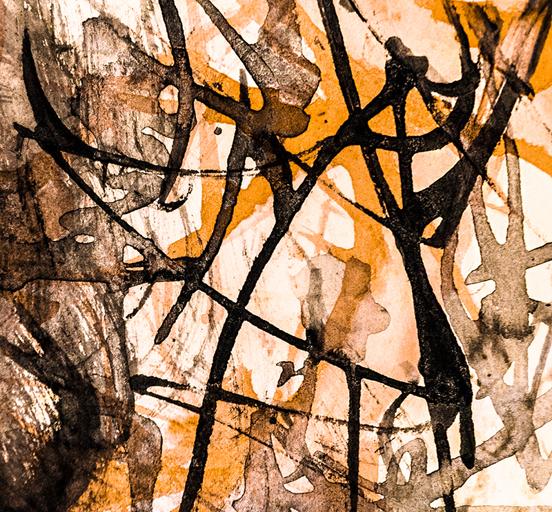
This is a slight variation on a theme I have been working the past several weeks. I enjoy creating the contrast between the dark ink and the bright watercolor. The ink was applied with a ruling pen.
Prints available from Fine Art America

Ink applied with a ruling pen on heavy stock paper with watercolor wash. This one takes the very minimalist ink with ruling pen idea and adds some color.
Ink and watercolor on mixed media stock
You must be logged in to post a comment.