This is another adventure with ink and watercolor washes on heavy stock paper. More and more, I am finding that the noise of the photograph can actually enhance the effect, especially on the screen.
Prints, including canvas and metal, available at Fine Art America.
This is another crop from the larger ink on watercolor painting I did two weeks ago. The first crop is called Vertical Parallel 1, so this is the second in a series of what will be three. This image is very wide, meaning it comes out very narrow in the format of this site; but if you click on it, you will see a larger version of it.
This one is ink on heavy stock with some light washes. I think it is another example of a very tight vertical crop working better than a traditional format.
Ink and watercolor on mixmedia stock. In the last week or two, I’ve been adding color to my ink sketches. Sometimes, the color goes on first, so it doesn’t interfere with the ink and is basically a background element. But at other times, I add the color later and let it interact with the ink. In this case, I added the color first as the background.
Ink and watercolor on mixmedia stock. This is a crop from a larger piece where I think the composition broke down. But I was really happy with how certain parts of it turned out. This is one of those smaller parts.
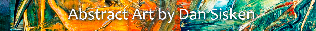
I have been enjoying experimenting with straight lines in ink that, for the most part, do not intersect. I have tried it with both the solid white background of the paper and with color and like the color much more. In my view, it gives the piece more depth and additional interest.
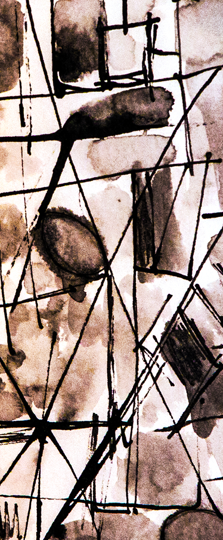
This one is red and black ink applied to multimedia paper with a flat wood piece and a calligraphic bamboo point that I cut myself. It is part of a larger piece that I wasn’t happy with, but I thought that the core–what you see here–had more interest with the arching, intersecting lines and colors. In addition, I desaturated this a fair amount in post-processing as the red is too overpowering in the original.
Prints available from Fine Art America where it is called “Entropy.”
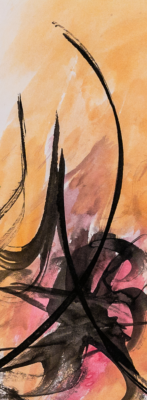
This was done with ink applied with a flat piece of wood that I fashioned into a calligraphy instrument. The idea was from Hassan Massoudy and some others on Youtube and other places.
This one was very “try it and see what happens.” The main idea was to start with a “splat” and then do some flowing strokes from there. I like the way it came out, although the follow-through was fairly spontaneous.


You must be logged in to post a comment.