This is another experiment, using just watercolor pencils, some washes, and regular graphite on light sketching paper. My technique was to create lines and a composition, along with some colors that I would bring out in more vibrant fashion in post-processing using Lightroom and a bit of Photoshop. Here is the original drawing, which doesn’t look like much. Very low contrast and not much color. Overall very flat.
In Lightroom, I added a bit more exposure, then cranked up the clarity and vibrance along with saturation (a bit). In doing, that the yellow color in the paper became much stronger. I also adjusted the whites and blacks to give it a bit more contrast. From there, I went into the color adjustments to modify the hue, luminance, and saturation. Finally, I tried a few sharpness and noise settings. I was not worried too much about the extensive noise, because I thought it lent some interesting texture to the image, which of course had been there from the beginning. Here is the final result.
This is a slight variation on a theme I have been working the past several weeks. I enjoy creating the contrast between the dark ink and the bright watercolor. The ink was applied with a ruling pen.
Ink applied with a ruling pen on heavy stock paper with watercolor wash. This one takes the very minimalist ink with ruling pen idea and adds some color.
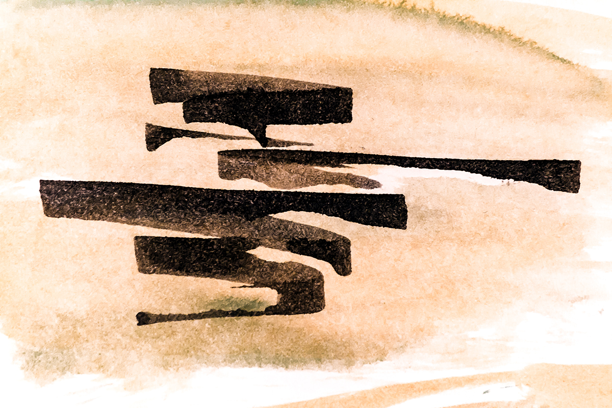
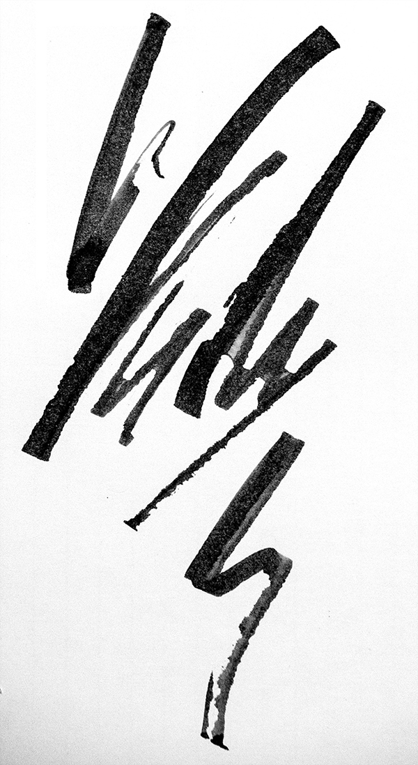
This is a third piece I’ve put up where I simply applied ink with a ruling pen. The idea of these is to create an interesting image, using very simple ink strokes. If there is balance and good spacing, there can be a pleasing result. Having spent some time experimenting with these, I think there is a principle at work similar to that in Japanese shodo (calligraphy), even though there is minimal resemblance between this and shodo. The principle, I think, is balance and harmony without symmetry or alignment. The ink spots/spray were created by digging into the paper with the pen so that the vibration caused the ink to spray.
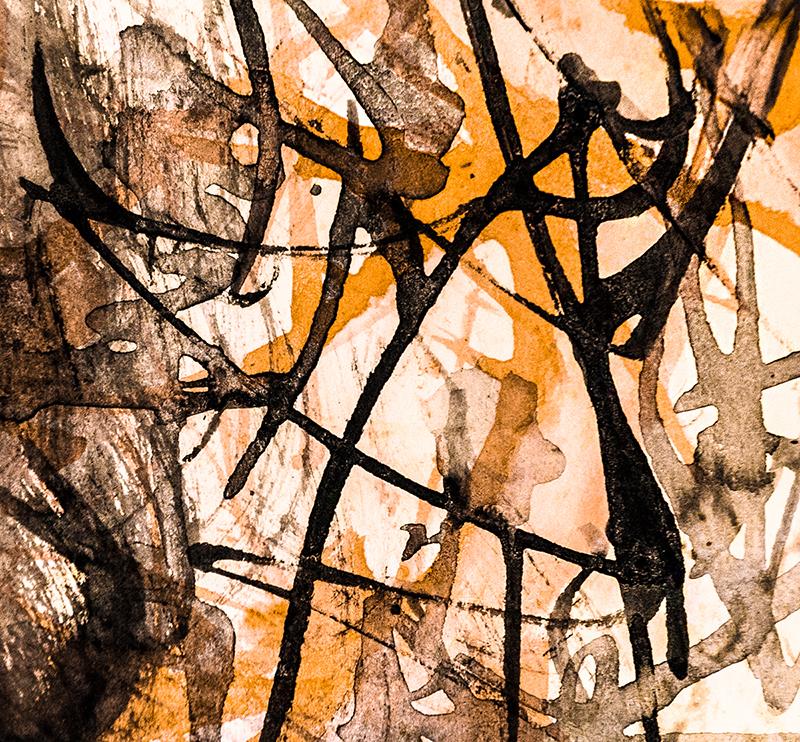
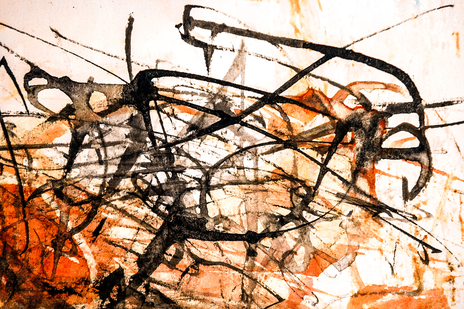
This is another piece where I used ink strokes on a background of watercolor. I imagine that it may be a bit too busy for some people, but others may enjoy letting their attention roam from one section to another, looking at colors, shapes, and lines. How do you see it?
This is a trial using an instrument I made out of tin called a “folded ruling pen.” I have a real one on back order, but these tools apparently are somewhat rare; hence an attempt to make my own (following instructions on Youtube). The behavior was not quite what I wanted, but some of the effects were nice. So, I will continue to experiment with this one and make some more.
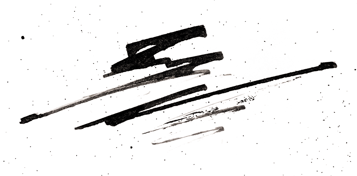
Sometimes abstract work defies my attempts to give it a title, but in this case, I think the ink does look a bit like it is encased in stone. Of course, others may see it differently, which is one of the neat things about abstract art.
This piece continues my explorations of using watercolor backgrounds to ink foregrounds and blends. I like how the textures turned out.


You must be logged in to post a comment.